

Hello! Today I'm going to talk about handwriting.
Let me start out with saying that I don't think handwriting will become outdated for a long, long time. If and when that happens, a great deal will be lost. No one will buy pretty stationery anymore, no one will look forward to writing on it using their new pens.
Anyways... the point is that currently, we use handwriting every day. Jotting down notes, brainstorming, writing reports, signing cards, etc. I think it's pretty cool how everyone has a different style of writing. By this I mean the kind of writing you do when you're not really paying attention to making your letters look pretty. You're just trying to get your thoughts down.
But sometimes when we write we try to adapt new, different styles. It's important to be creative when doing this, especially when you're working on an art project, because interesting typography can make a big difference!
When you're journaling, you can add some funky headers to your pages. When you're making a card a fun handwriting style can make the recipient smile. If you're designing a blog header by hand, this is definitely important. This is why I decided to write this post.
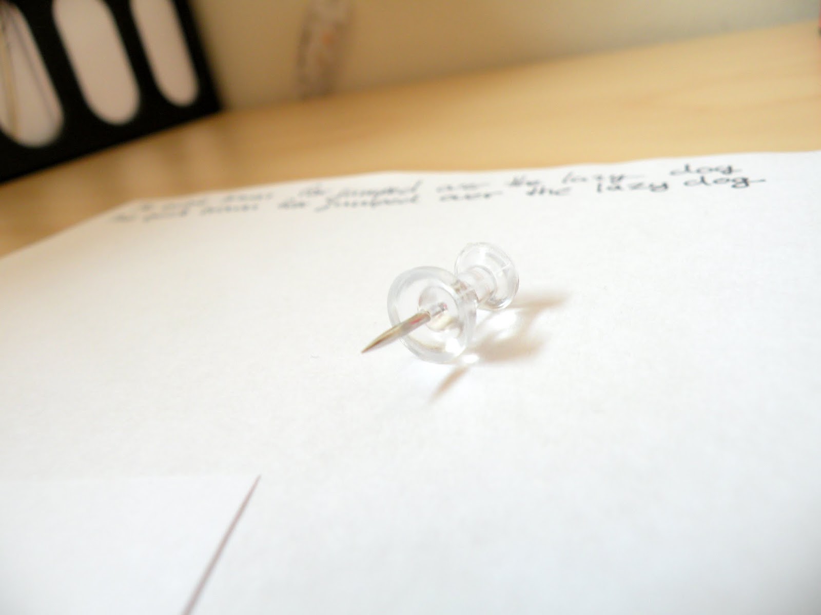
If you want to improve your handwriting or spice up your art, the first thing you'll need is a pencil and a piece of paper. Pick a phrase or word to use. A good one is "the quick brown fox jumps over the lazy dog" because it uses all the letters of the alphabet. If that's too long you can try using your name, unless it's very short!

Once you've decided what you'll write, write it at the top of the page using the "quick and fast" handwriting I mentioned before, your "normal handwriting".
Now look at that and recreate it, but this time do it slowly, essentially creating a neat version of your "quick and fast" handwriting.
Now you can experiment with different ways to write! Here is a list of things you can experiment with:
1 // Try bubble letters. make them bold, make them skinny. Shade them in, fill them with a pattern.
2 // Connecting your letters vs. not connecting them.
3 // Space between your letters.
4 // Height of your letters compared to the width. Make them short and wide, then tall and skinny.
5 // Raise and lower the "dotted line". The dotted line is where you cross your t's, I think you'll see what I mean in the photo below.
6 // Make your lines rigid, then curve all of them a bit.
7 // Loop the tails of your j's, q's, g's, and y's.
8 // All lower-case vs. all upper-case.


Find inspiration in magazines (the one in the photo is a Bloomingdales magazine) and little pieces of paper.


Once you're done experimenting, get a new sheet of paper to write down your favorite "fonts". You can even give them names! You can use this as a reference sheet for when you're doing something where you think a nice font would look good.
Whenever you have time, take out a notebook and practice using these fonts.
You can also use a similar technique to simply improve your handwriting. Once you've looked at what your "quick" handwriting looks like and what your "neat" handwriting looks like, you can decide what you would like to change about it. Then practice writing like that over and over again.
I think writing in different ways is really fun, and I hope this post inspired you!
Thanks for reading, and have a lovely day!
I love seeing everyone's different handwriting, you can tell a lot about a person by their writing!
ReplyDeletex Erin
http://louiseerin.blogspot.com.au/
That's a great post! I like it. :D
ReplyDeleteHope you can visit my blog. I'm a new follower. :)
Sammie
sammiethestargirl.blogspot.com
Thank you so much! I visited your blog just now. I love it! Thank you for commenting.
Delete